Meet Kwaku. This summer, he’s working as our head Graphic Designer and Artist in Residence. After meeting with Naomi (CO), Kun (CTO), and Marwan (CEO) to discuss Tekuma’s mission, his job was to re-design our branding identity. This meant wiping the slate clean and starting from scratch. To most, this task would feel daunting. Kwaku made it look easy.
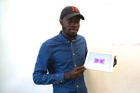
The name “Tekuma” was originally created by combining the first syllables of the founder’s first names: TE (Tengjia), KU (Kun), MA (Marwan). Later, the team discovered that “Tekuma” means rebirth, renew, and revival in Hebrew. What’s more, Tekuma’s original icon symbolized the outline of a butterfly – coincidentally reaffirming the team’s linguistic meaning. Here’s a picture of the original icon.
Kwaku ran with these concepts to create new and improved iconography. His new design fuses Tekuma’s mission, “Art needs Space / Space needs Art,” with the rebirth of the butterfly to create an overarching, simplified concept: the renewal of space through art. Below is Kwaku’s first ittiration of the rebranding of Tekuma.